Solution Manual for Statistics for Business: Decision Making and Analysis, 3rd Edition

Get the textbook answers you need with Solution Manual for Statistics for Business: Decision Making and Analysis, 3rd Edition, an essential guide to solving textbook problems.

Leo Bailey
Contributor
4.1
42
5 months ago
Preview (16 of 232 Pages)
100%
Purchase to unlock

Page 1

Solution Manual for Statistics for Business: Decision Making and Analysis, 3rd Edition - Page 1 preview image

Loading page image...

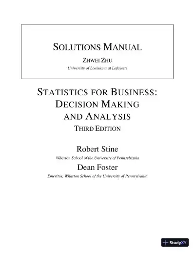
SOLUTIONSMANUALZHWEIZHUUniversity of Louisiana at LafayetteSTATISTICS FORBUSINESS:DECISIONMAKINGANDANALYSISTHIRDEDITIONRobert StineWharton School of the University of PennsylvaniaDean FosterEmeritus, Wharton School of the University of Pennsylvania

Page 2

Solution Manual for Statistics for Business: Decision Making and Analysis, 3rd Edition - Page 2 preview image

Loading page image...

Page 3

Solution Manual for Statistics for Business: Decision Making and Analysis, 3rd Edition - Page 3 preview image

Loading page image...

Contents2. Data 13. Describing Categorical Data 44. Describing Numerical Data 175. Association between Categorical Variables 266. Association between Quantitative Variables 377. Probability 488. Conditional Probability 559. Random Variables 6210. Association between Random Variables 7011. Probability Models for Counts 7712. The Normal Probability Model 8313. Samples and Surveys 9114. Sampling Variation and Quality 9515. Confidence Intervals 10316. Statistical Tests 11117. Comparison 11818. Inference for Counts 12519. Linear Patterns 12920. Curved Patterns 14021. The Simple Regression Model 15122. Regression Diagnostics 16023. Multiple Regression 16824. Building Regression Models 18325. Categorical Explanatory Variables 19326. Analysis of Variance 20727. Time Series 218

Page 4

Solution Manual for Statistics for Business: Decision Making and Analysis, 3rd Edition - Page 4 preview image

Loading page image...

Page 5

Solution Manual for Statistics for Business: Decision Making and Analysis, 3rd Edition - Page 5 preview image

Loading page image...

1Chapter 2: DataMix and Match1.Variable Name: brand of car; Type: nominal;Cases: drivers2.Variable Name: household income; Type:numerical; Cases: households3.Variable Name: color preference; Type: nominal;Cases: consumers in focus group4.Variable Name: customer counts; Type:numerical; Cases: outlets of retail chain5.Variable Name: item size; Type: ordinal; Cases:unknown (could be stocks in stores or purchaseamounts)6.Variable Name: shipping cost; Type: numerical;Cases: unknown (could be a time series or couldbe the costs for various items or destinations)7.Variable Name: stock price; Type: numerical;Cases: companies (though the question is vague)8.Variable Name: number absent; Type:numerical; Time Series Frequency: days9.Variable Name: Sex; Type: nominal; Cases:respondents in survey10.Variable Name: Education; Type: ordinal; Cases:customersTrue/False11.False. Zip codes are numbers, but these numbersare used only for identification and would nothave any numerical meaning.12.True.13.False. Cases is another name for the rows in adata table.14.True.15.True.16.False. A row holds an observation.17.False. A Likert scale is used for ordinal data.18.True.19.False. Aggregation collapses a table into onewith fewer rows.20.True.Think About It21.(a)The data are cross sectional.(b)The variables are whether the employeeopened an IRA (nominal) and the Amount saved(numerical with dollars as the units).(c)Did employees respond honestly,particularly when it came to the amount theyreported to have saved?22.(a)The data are cross sectional.(b)The variables are Reaction to increase(categorical, or perhaps ordinal if asked to ratethe chance of moving to another bank), Currentbalance and other aspects of the customer thatwould be useful additions to the data. (Bank maynot care if it loses unprofitable customers.)(c)How many customers responded to thequestionnaire? Were their responses aboutleaving the bank sincere?23.(a)The data are cross sectional.(b)The variable is the Service rating (ordinalmost likely, using a Likert scale).(c)With only 450 replying, are the respondentsrepresentative of the other guests?24.(a)The data are cross sectional.(b)The variables are whether a coupon wasused (nominal) and Purchase amount (numericalwith dollars as the units).

Page 6

Solution Manual for Statistics for Business: Decision Making and Analysis, 3rd Edition - Page 6 preview image

Loading page image...

2Statistics for Business,3rd Edition(c)How were these homes chosen? Was there atime limit on redemption?25.(a)The data are a time series.(b)The variable is the Exchange rate of the USdollar to the Canadian dollar (numerical ratio ofcurrencies).(c)Are the fluctuations in 2016 typical of otheryears?26.(a)The data are a time series.(b)The variable is the Average time spent onthe lot for ten car models (numerical for eachmodel).(c)Did dealers accurately report thisinformation? Were all dealers surveyed, or justsome of them? If it’s a survey, did it concentratemore in some regions than others?27.(a)The data are cross-sectional.(b)The variables are the Quality of the graphics(ordinal from bad to good) and the Degree ofviolence (ordinal from none to too much).(c)Did some of the participants influence theopinions of others?28.(a)The data are cross sectional.(b)The variables are Income (numerical withunits in dollars), Sex (nominal), Location(nominal), Number of cards (numerical count)and Profit (numerical with dollars as the units,derived from other data).(c)Why were these accounts sampled and notall of them?29.(a)The data are cross sectional (though theycould be converted to a time series).(b)The variables are Name (nominal), Zip code(nominal), Region (nominal), Date of purchase(nominal or numerical, depending on the context;the company could compute the average lengthof time since the last purchase), Amount ofpurchase (numerical with dollars as the units)and Item purchased (nominal).(c)Presumably the region was recorded fromthe zip code.30.(a)The data are a time series.(b)The variable is Vehicle type (nominal orordinal as compact, regular, large and SUV)(c)The mix of cars on the weekend may not bethe same as on a weekday. Do employees get anaccurate count since they have other things to doas well?4M Economic Time Series(a)Answers will vary, but should resemble thefollowing.By merging the data, we can see how sales of BestBuy move along with the health of the generaleconomy. If sales at Best Buy rise and fall withdisposable income, we might question the health ofthis company if the government predicts a drop in theamount of disposable income.(b)A row in the data from FRED2 describes thelevel of disposable income in a month whereas a rowin the company-specific data is quarterly,summarizing a quarter (3 months).(c)The columns are both numbers of dollars, butwith different multipliers. The national disposableincome is in billions (so the value for January 2010means that consumers have $11.041 trillion annuallyto spend). The quarterly sales are in millions (so BestBuy’s net sales in the first quarter of 2010 were$3.036 billion).(d)We can aggregate the monthly numbers into aquarterly number such as by taking an average(FRED2 will do this for you if you want to return tothe web site). Alternatively, we could take thequarterly number and spread it over the months.That’s a bit hard to do, so the first path is morecommon.(e)Name the columns Net Sales ($ billion) and DispIncome ($ trillion) and scale as shown previously.That avoids lots of extraneous zeros if you were, forexample, to label them all as dollars. The dates mightbest be recorded in a single column as, say, 2010:1,2010:2, and so forth, or in the style shown in thefollowing table.(f)Here’s the merged data table for 2010:QuarterNet Sales($ billion)Disp Income($ trillion)Jan-2010$3.036$33.124Apr-2010$3.156$33.593Jul-2010$3.233$33.860Oct-2010$4.214$34.277

Page 7

Solution Manual for Statistics for Business: Decision Making and Analysis, 3rd Edition - Page 7 preview image

Loading page image...

Chapter 2: Data3(g)Sales at Best Buy rocket up in the fourth quarter(30% higher during the holiday season), butconsumers don’t have that much more money tospend. Looks like some people spend a lot moreduring the holidays, no surprise there!4M Textbooks(a)Various sources report that books cost about$100 per class. In 2003, U.S. Senator Charles E.Schumer of New York released a study showing thatthe average New York freshman or sophomore pays$922 for textbooks in a year. So reducing the cost 5%would save $46.10 a year and by 10% would save$92.20 a year.(b)Your table should have headings like these. Youshould use the names of the stores you shopped at ifdifferent from these. The first two columns arenominal, with the first identifying the book and thesecond giving the label. The two columns of pricesare both numerical.BookTitleTypePrice atAmazonPrice atB&N(c)These will vary. Presumably, you’ve got fivetextbooks from your current classes. Hopefully,you’ve also got some other personal books. Forpopular books, you might consider books on one ofthe best-seller lists or those at the top of the listsoffered on-line.(d)You may have to change the list of books,particularly for textbooks. Some on line sites have alimited selection of these.(e)You should include all of the relevant costs.Some Internet retailers add high shipping costs.(f)Again, answers will vary depending on thechoice of books and the choice of stores. The key tonotice is the value of comparison. Because you’vegot two prices for the same books, you can compareapples to apples and see whether one retailer issystematically cheaper than the other

Page 8

Solution Manual for Statistics for Business: Decision Making and Analysis, 3rd Edition - Page 8 preview image

Loading page image...

4Chapter 3: Describing Categorical DataMix and MatchIn each case, unless noted, bar charts are better to emphasize counts whereas pie charts are better to communicatethe relative share of the total amount.1.Proportion of autos: pie chart is the most common; a bar chart or Pareto chart can also be used.2.Types of defects: Pareto chart (a bar chart with the categories sorted in order of the most common defect)3.Coupons: bar chart or Pareto chart (these are counts) or perhaps a table (only three values)4.Type of automobile: bar chart or Pareto chart (counts) or pie chart (shares)5.Destination: bar chart or Pareto chart (counts) or pie chart (shares)6.Hanging up: Pareto chart (counts)7.Excuses: Pareto chart (counts)8.Brand of computer: bar chart (counts) or pie chart (shares)9.Software: pie chart (shares) or perhaps a table (only three values)10.Camera: bar chart (counts), pie chart (shares), or a table (only three values)11.Ratings: Bar chart or table (only four values). Because the values are ordinal, avoid a pie chart.12.Loans: Bar chart or table (only three values). Because the data is ordinal, it should not be put into a pie chart –even though the plot shows shares.True/False13.True, but only in general. For variables with few categories, a frequency table is often better, particularly whenthe analysis requires knowing the detailed frequencies.14.False. The measure of variation has to be within one category.15.False. The frequency is the count of the items.16.False. A relative frequency is a proportion.

Page 9

Solution Manual for Statistics for Business: Decision Making and Analysis, 3rd Edition - Page 9 preview image

Loading page image...

Chapter 3: Describing Categorical Data517.True. It would be false if the variable were ordinal; you should not put the shares of an ordinal variable into apie chart.18.False. The proportion must match the relative frequency.19.True.20.False. It has fewer bars.21.True.22.False. The median only applies to ordinal variables and identifies the category of the middle value.Think About It23.The message is that customers tend to stick with manufacturers from the same region. Someone trading in adomestic car tends to get another domestic car whereas someone who trades in an Asian car tends to buyanother Asian car. There’s not a lot of switching of loyalties. The more subtle message, one that is disturbing todomestic car makers, is that those who own Asian cars are more loyal (78% buy another Asian car compared to69% who stick with a domestic car). That makes it hard for domestic manufacturers to win back customers,even if they improve the quality of their cars.24.The answer is yes. Since lighting makes up 37% of the use of electricity, reducing the demand for electricity byusing more efficient bulbs can have a substantial impact. Compact fluorescent bulbs produce the same amountof light with much less, say one-quarter, of the electricity used by an incandescent bulbs. Less energy alsoimplies less heat and lower cooling costs. That said, the benefit of these savings for utilities is less pronouncedbecause these savings happen mostly at night, not during the times of peak load that occur during the daytime.25.This is a bar chart if you think about the underlying data as labeling the dollars held in these countries. Theintent of the plot is to show the relative sizes of these counts, comparing the shares of U.S. debt held in thesecountries.26.No, this is not a bar chart in the sense of this chapter. The chart uses bars to show a very short time series withfive data points, the annual revenue in 2011-2015. Hence, it is a time plot that uses bars to show the data.27.(a)No, these categories are not mutually exclusive. These percentages summarize four dichotomous variables,not one variable.(b)Divided bars such as these might work well. This style is commonly used in reporting opinion poll resultsin the news. Sorting the values so that the percentages are in order also makes for a cleaner presentation.

Page 10

Solution Manual for Statistics for Business: Decision Making and Analysis, 3rd Edition - Page 10 preview image

Loading page image...

6Statistics for Business,3rd Edition28.(a)No. Each customer could report several of these items, so the categories are not mutually exclusive.(b)A figure such as the divided bars used in Exercise 27 would be useful to illustrate the varying shares.29.No. These percentages only list the percent of executives that report each problem. The categories are notmutually exclusive; some of the executives listed several issues.30.The percentages do not add to 100; we need another category (which has a 9% share of the market).31.A bar chart would not be appropriate for this situation since the variable, the amount spent by the last 200customers, is a continuous variable.32.This grouping data into categories is one step in constructing a frequency table. A histogram should be usedsince it reports a continuous variable, not a bar chart (a bar chart should be used when you deal with categoryvariable).33.The bar chart would have one very long bar (height 900) and five shorter bars of height 20 each. The plot wouldnot be very useful, other than to show the predominance of one category.34.A pie chart would devote 90% of its area to the main category and divide the remaining area into five smallslices, each with equal area of 2%.35.The bar chart would have five bars, each of the same height.36.The bar chart. It would be hard to tell in the pie chart that the slices were of the same size (however, if the sliceswere labeled with the percentages it would be the same).37.A bar chart is preferred because the categorical nature of the variable. A pie chart also can be used to presentthis data. A frequency table is not appropriate in this situation.38.With so many categories (the 51 states, including Washington D.C.), some aggregation by region might beuseful. Alternatively, it might be good to highlight the most common states, and combine the rest together into aseparate, other category. A bar chart or pie chart could be used, and a frequency table would be fine if therewere only a few states represented.39.The mode is Public. There’s no median for this chart since this is nominal data.40.The East is the modal location. To find the median size, notice there are 50 sizes given, so the median is the sizein position 25 or 26. Both lie in the category 10,000 to 19,999. The percentages of enrollment categories, notcounts, should be shown in a pie chart.41.The manufacturers want to know the modal preference because it identifies the most common color preference.Color preferences cannot be ordered, the median color preference can’t be defined.42.A median rating of Excellent implies that at least one-half rated the service as Excellent. A modal rating ofExcellent implies that this is the most common rating, but far fewer than half might have picked this rating.43.The radius of the circle for consumer electronics, for example, would have to be sqrt (10.5/9.1) times the radiusof the circle for cell phones, sqrt(10.5/6.3) times the radius for chips, and sqrt(10.5/5.7) times the radius forLCD panels.

Page 11

Solution Manual for Statistics for Business: Decision Making and Analysis, 3rd Edition - Page 11 preview image

Loading page image...

Chapter 3: Describing Categorical Data744.For instance, render as dollar bills with area determined by the amounts.You Do It45.(a) It probably accumulates case sales by brand over some period, such as daily or weekly. It is unlikely thatevery case is represented by a row.(b) A pie chart emphasizes shares.(c)(d)

Page 12

Solution Manual for Statistics for Business: Decision Making and Analysis, 3rd Edition - Page 12 preview image

Loading page image...

8Statistics for Business,3rd Edition46.(a)(b)(c)

Page 13

Solution Manual for Statistics for Business: Decision Making and Analysis, 3rd Edition - Page 13 preview image

Loading page image...

Chapter 3: Describing Categorical Data947.(a) The Other category forms an additional row in the tables so that each column adds up to 100%. The additionof this extra row makes up a big part of both pie charts.(b) The side-by-side bar chart works well for this. Notice that we no longer need the Other category thatdominates the pie charts.(c) No, because the categories would no longer partition the cases into distinct, non-overlapping subsets. A piechart should only be used to summarize mutually exclusive groups.48.(a) The totals within a row do not sum to 100%. The columns give the proportion with different types of media,and these can sum to more than 100% as well. The represented categories do not divide the homes into differentgroups; a bedroom could have all of these media.(b) The side-by-side bar chart shows more of every type of media in the rooms of older children.(c) The big adoption of games appears to happen in the 8-13 age range.

Page 14

Solution Manual for Statistics for Business: Decision Making and Analysis, 3rd Edition - Page 14 preview image

Loading page image...

10Statistics for Business,3rd Edition49.50.(a) The pie charts are favored slightly over the side-by-side bar charts.(b) No; to compare, count, not percentages, are needed.

Page 15

Solution Manual for Statistics for Business: Decision Making and Analysis, 3rd Edition - Page 15 preview image

Loading page image...

Chapter 3: Describing Categorical Data1151.(a)(b)52.(a) No, the percentages do not add; some respondents gave more than one reason.(b) No, unless you think there is a natural way to prioritize the reasons.(c) A bar chart, with the length given by the percentage.53.(a) Use a table with the two rows and the percentages (or proportions)Unexpected illness4,46315.8%Planned leave23,73584.2%

Page 16

Solution Manual for Statistics for Business: Decision Making and Analysis, 3rd Edition - Page 16 preview image

Loading page image...

12Statistics for Business,3rd Edition(b)A Pareto chart shows the categories in order of size.54.(a) Kraft plus Cadbury (15.2%) becomes the mode.(b) Yes, if the Hershey items are much less expensive than those of other brands.55.(a) Yes, pie charts are fine because the responses are mutually exclusive and sum to 100%.(b) Various answers are possible. The following layout is reasonable.(c) The bar chart facilitates comparison. The pie chart makes the relative shares more apparent. For example,the 2003 pie shows a predominant share for taking no action, the only choice anticipated to fall in 2008.(d) The mode and median agree (virtually none) in 2003, but differ in 2008 as responses shift from the moreconsistent response to a tendency to do more off shoring.
Preview Mode

This document has 232 pages. Sign in to access the full document!

Study Now!

XY-Copilot AI
Unlimited Access
Secure Payment
Instant Access
24/7 Support
Document Chat

Document Details

Subject
Statistics

Related Documents

View all