Solution Manual For The Basic Practice of Statistics, 8th Edition

Struggling with textbook exercises? Solution Manual For The Basic Practice of Statistics, 8th Edition breaks down solutions in a way that�s easy to understand.

Gabriel Adams
Contributor
4.5
55
5 months ago
Preview (16 of 410 Pages)
100%
Purchase to unlock

Loading document content...

Preview Mode

Sign in to access the full document!

Solution Manual For The Basic Practice of Statistics, 8th Edition

Page 1

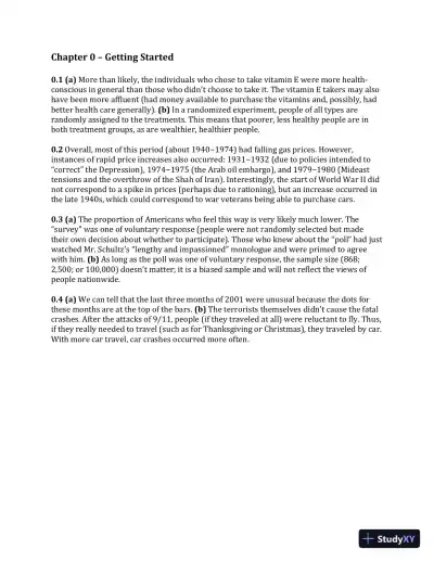
Chapter 0 Getting Started 0.1 (a) More than likely, the individuals who chose to take vitamin E were more health- conscious in general than those who didn’t choose to take it. The vitamin E takers may also have been more affluent (had money available to purchase the vitamins and, possibly, had better health care generally). (b) In a randomized experiment, people of all types are randomly assigned to the treatments. This means that poorer, less healthy people are in both treatment groups, as are wealthier, healthier people. 0.2 Overall, most of this period (about 1940 1974) had falling gas prices. However, instances of rapid price increases also occurred: 1931 1932 (due to policies intended to “correct” the Depression ), 1974 1975 (the Arab oil embargo), and 1979 1980 (Mideast tensions and the overthrow of the Shah of Iran). Interestingly, the start of World War II did not correspond to a spike in prices (perhaps due to rationing), but an increase occurred in the late 1940s, which could correspond to war veterans being able to purchase cars. 0.3 (a) The proportion of Americans who feel this way is very likely much lower. The “survey” was one of voluntary response (people were not randomly selected but made their own decision about whether to participate). Those who knew about the “poll” had just watched Mr. Schultz’ s “lengthy and impassioned” monologue and were primed to agree with him. (b) As long as the poll was one of voluntary response, the sample size (868; 2,500; or 100,000) doesn’t matter; it is a biased sample and will not reflect the views of people nationwide. 0.4 (a) We can tell that the last three months of 2001 were unusual because the dots for these months are at the top of the bars. (b) The terrorists themselves didn’t cause the fatal crashes. After the attacks of 9/11, people (if they traveled at all) were reluctant to fly. Thus, if they really needed to travel (such as for Thanksgiving or Christmas), they traveled by car. With more car travel, car crashes occurred more often.

Page 2

Page 3

Chapter 1 – Picturing Distributions with Graphs 1.1 (a) The individuals are the car makes and models. (b) For each individual, the variables recorded are: vehicle class (categorical), transmission type (categorical), number of cylinders (usually treated as quantitative), city mpg (quantitative), highway mpg (quantitative), and annual fuel cost in dollars (quantitative). 1.2 Answers will vary. Some possible categorical variables: whether or not the student plays sports; sex; whether or not the student smokes; and attitude about exercise. Some possible quantitative variables: weight (kilograms or pounds), height (centimeters or inches); resting heart rate (beats per minute); and body mass index (kg/m 2 or lb/ft 2 ). 1.3 (a) 91% use these top social media sites; 9% use other sites most often. (b) A bar graph is provided. (c) If you include an “Other” category, then a pie chart is appropriate. This survey asked about the site used most often, so each individual is only represented in one category, and the categories make up the whole. 0 10 20 30 40 50 Facebook Instagram Snapchat Twitter Google+ Pinterest Other Percentage Social media site Percent Used Most Often Among Americans Aged 12—24

Page 4

1.4 (a) Individuals fall into more than one of the categories. (b) A bar graph is shown.

Page 5

1.5 A pie chart can be made because the days are non-overlapping and make up the whole. Some births are scheduled (induced labor, for example) and, probably, most are scheduled for weekdays. 1.6 Make this histogram by hand, as the instructions suggest. 1.7 Use the applet to answer these questions. 1.8 The distribution is slightly right-skewed. The center is between 30% and 40% (23 states have less than 30% minority residents, and another 10 states have between 30% and 40%). The statewide percents range from about 0% to about 80%. No states have an unusually large or small percent of minority residents. 1.9 (a) There are two clear peaks in the distribution. If we gave only one center, it would most likely be between these and not be truly representative. (b) Young boys might spend a lot of time outdoors playing; their time outside in places where they would encounter ticks might well be less in younger adulthood. With families and yard work, their time outside might increase. (c) No, this is incorrect. Hiking in the woods at any age will make a person more likely to encounter the ticks that spread Lyme disease. (d) The histograms have the same shapes, but females have a slightly lower incidence rate until age 65, after which females have a slightly higher rate. Females under age 65, possibly, spend less time outdoors in areas where they would encounter ticks.

Page 6

1.10 (a) A stemplot is provided. With a single stem, the distribution appeared unimodal. After splitting the stems, it appears bimodal. 0 88 9 1 1 1 556789 2 022333333 2 6778 3 01114 3 5799 4 01112 4 588 5 1112234 5 6 1 6 77 7 7 5 (b) The histogram with bins of width 5 will give the same pattern as the stemplot from part (a).

Page 7

1.11 Here is a stemplot for health expenditure per capita (in PPP). Data are rounded to units of hundreds. For example, Argentina’s 1725 becomes 17. Stems are thousands and are split, as prescribed. This distribution is right-skewed, with a single high outlier (United States). There seem to be two clusters of countries. The center of this distribution is around 20 ($2000 spent per capita). The distribution varies from 0|2 (about $200 spent per capita) to 9|1 (about $9100 spent per capita). 0 223 0 67789 1 1114 1 56677 2 24 2 8 3 13 3 7 4 223 4 56889 5 5 6 6 23 6 7 7 8 8 9 1 1.12 (a) A time plot of average tuition and fees is given. (b) Average tuition and fees have steadily climbed during the 35-year period, with sharpest absolute increases between 2009 and 2012. (c) Average tuition and fees have not decreased (as shown in this plot), but there have been periods of very small increases (1995–2000 and 2012–2013, for example). There are two periods of very rapid increases: 2000–2005 and 2008–2012. (d) It would be better to use percent increases rather than dollar increases. A 10% increase in average tuition

Page 8

and fees in 1980 should correspond to a 10% increase in average tuition and fees in 2005, but the absolute dollar increases in these cases are very different. 1.13 (a) the students. 1.14 (c) a bar graph but not a pie chart. Individuals could belong to more than one category. 1.15 (b) Square footage and average monthly gas bill are both quantitative variables. 1.16 (b) categorical variable. Zip codes are equivalent to town (or zone) names or identifications, and you can’t do arithmetic meaningfully with them. 1.17 (b) 88% to 92%. 1.18 (b) 2, 3, 4, 5, 6, 7, 8, 9. 1.19 (b) 76%. There are 50 observations, so the center would be between the 25 th and 26 th observations; both of these are 76%. 1.20 (a) skewed to the left. 1.21 (c) 34% enrolled. The stems are rounded to whole percents; you cannot make finer judgments. 1.22 (c) skewed to the right. 1.23 (a) Individuals are students who have finished medical school. (b) Five, in addition to “Name.” “Age” (in years) and “USMLE” (in score points) are quantitative. The others are categorical. 1.24 The categorical variables are freezer type and Energy Star compliant (yes/no). The quantitative variables are annual energy consumption (kw), width (in), depth (in), height (in), freezer capacity (ft 3 ), and refrigerator capacity (ft 3 ). The individuals are the refrigerator makes and models.

Page 9

1.25 “Other colors” should account for 2%. A bar graph would be an appropriate display. If you included the “Other” category, a pie chart could also be made. 1.26 (a) A bar graph for the percent who used any tobacco product is given. The percent stayed relatively constant, with a slight decrease from 2011 to 2013 and increasing since. 21 22 23 24 25 26 2011 2012 2013 2014 2015 Percentage Year Percentage of High Schoolers Who Used Any Tobacco Product in Last 30 Days

Page 10

(b) See the bar chart given. (c) The plot in part (b) shows that the recent increase in tobacco usage is due to a drastic increase in the use of e-cigarettes. Usage of other forms of tobacco has decreased since 2011. 1.27 (a) A bar graph is given. (b) Yes, we can construct a pie chart if we provide an "Other" category, where the total number of deaths in the "Other" category is 28486-11619-4878-4329-1496- 1170-362=4632. The creation of an "Other" category is required for a pie chart so that the number of deaths in each subcategory sum to the total number of deaths. Without an "Other" category, we cannot construct a pie chart. 1.28 About 20% had debt between $25,000 and $49,999. Less than 5% had debt above $150,000, but it is hard to tell from the plot. 0 5 10 15 20 Cigarettes Cigars Pipes Smokeless tobacco E-cigarettes Percentage Percentage of High Schoolers Who Used Tobacco 2011 2012 2013 2014 2015

Page 11

1.29 (a) A bar graph is provided. (b) For the 18–34 age group, the hours are roughly equal. For the older age groups, social apps are used more often than entertainment apps. (c) A pie chart is not appropriate because these data do not represent all parts of a whole. 1.30 This distribution is right-skewed, with the center around two servings and a variability of zero to eight servings. There are no outliers. About 12% (9 out of 74) consumed six or more servings, and about 35% (26 out of 74) ate fewer than two servings (zero or one serving). 1.31 (a) Ignoring the four lower outliers, the distribution is roughly symmetric, is centered at a score of 111, and has a range of 86 to 136. (b) 62 of the 78 scores are more than 100. This is 79.5%. 1.32 (a) The distribution is slightly left-skewed (some might call it almost symmetric). (b) The center is somewhere between 0% and 2.5%. (c) The smallest value is somewhere between –12.5% and –10%, and the largest value is between 12.5% and 15%. (d) There are about 140 negative returns, although your estimate could differ. This corresponds to about 38%. 1.33 (1.) “Are you female or male?” is Histogram (c). There are two outcomes possible, and the difference in frequencies is likely to be smaller than the right- handed/left-handed difference in part (2). (2.) “ Are you right-handed or left- handed?” is Histogram (b), since there are more right-handed people than left- handed people, and the difference is likely larger than the sex difference in part (1). (3.) “What is your height in inches?” is Histogram (d). Height distribution is likely to be symmetric. (4.) “How many minutes do you study on a typical weeknight?” is Histogram (a). The variable takes on more than two values, and time spent studying may well be a right-skewed distribution, with most students spending less time studying, but some students studying a lot.

Page 12

1.34 (a) A histogram is provided. (b) This is an extremely right-skewed distribution. Ratios greater than 1 correspond to an oil with more omega-3 than omega-6. This accounts for 7 of the 30 oils, or 23.3%. Most food oils aren’t this healthy. (c) Of the 7 healthier food oils, 5 come from types of fish. Furthermore, all of the fish oils in the list have ratios higher than 1. Clearly, fish oils provide a healthier ratio of omega-3 to omega-6 acids. 1.35 (a) States vary in population, so you would expect more nurses in California than in Wyoming, for example. Nurses per 100,000 provides a better measure of the number of nurses available to serve a state’s population. (b) A stemplot is provided. Round the data to the nearest ten, and use the stems for hundreds and the leaves for tens. The distribution is slightly left-skewed, with a center around 900 and a range from 590 to 1480 nurses per 100,000. The observation with 1480 nurses is an outlier. This corresponds to Washington D.C.; many people live in states surrounding D.C. but commute to D.C. to health care. Stem Leaf 14 8 1 3 0 1 2 6 11 06 10 0122234599 9 001113455578 8 001133556668 7 246 6 11347889 5 9 (c) Splitting the stems would be useful, because it would better allow you to see the variability between the large number of states with between 800 and 1100 nurses per 100,000. 6 5 4 3 2 1 0 25 20 15 10 5 0 Ratio Frequency Food Oils Ratio of Omega-3 to Omega-6

Page 13

1.36 (a) Because the countries have varying populations, comparing them by deaths per 1000 children is easier than by total number of children. (b) The histogram is provided. The distribution is right-skewed, with a center around 20 deaths per 1000 children. The range is from just above 0 to 160. Angola may be considered an outlier, with a death rate of about 160. 1.37 The stemplot (after rounding to the nearest thousand) is shown. The shape of the distribution is roughly symmetric (it might be called left-skewed if we ignore the high outlier); with this scaling, 245 seems to be a high outlier. The center is about 171 (the 12th observation). The data range from about 91 to about 245. Stem Leaf 24 6 23 22 21 20 1244 19 2 18 22 17 022399 16 68 1 5 14 13 12 11 10 9 9 6 3 0 3 257

Page 14

1.38 (a) A negative value means that the virtual operation took longer after the four-week program than it took before the program. (b) The stemplot is provided. Treatment Control - 0 8 122 - 0 1 3 0 233 44 888776 0 5567789999 43332 1 1 9 1 5 44 21 2 3 8 2 3 3 (c) The center for the treatment group is about 130 seconds; for the control group, the center is about 60 seconds. It appears that the treatment group had larger differences, so had greater improvement. 1.39 A time plot of fur seal pups. The decline in population is not seen in the stemplot made in Exercise 1.37.

Page 15

1.40 (a) Rates are appropriate (rather than numbers of accidents) because the group sizes are different. If marijuana did not increase with the rate of accidents, then you would still have more accidents (by count) in the largest groups. (b) The rates were computed as accidents / (number of drivers) in each group; a bar graph is given. While we cannot conclude that marijuana use causes accidents, it is certainly associated with a greater accident rate. Perhaps the “risk taking” aspect mentioned might also be an explanation. 51 + times 11-50 times 1-10 times Never 0.35 0.30 0.25 0.20 0.15 0.10 0.05 0.00 Marijuana Use per Year Accident Rate per Driver Marijuana Use and Accidents in New Zealand

Page 16

1.41 (a) A bar graph is provided. Three separate bar graphs could also have been produced. (b) All countries spend much more time on either a desktop or a smartphone app. The U.S. uses smartphone apps more than desktops, which is not true for Canada and the U.K. (c) A pie chart can be constructed because within each country, the five categories listed cover all possible choices of access method, with the sum of the percents being 100. Comparing the distributions across country is easier with the side-by-side bar graph because the bars are grouped by access method.
Chapter 0 – Getting Started 0.1 (a) More than likely, the individuals who chose to take vitamin E were more health- conscious in general than those who didn’t choose to take it. The vitamin E takers may also have been more affluent (had money available to purchase the vitamins and, possibly, had better health care generally). (b) In a randomized experiment, people of all types are randomly assigned to the treatments. This means that poorer, less healthy people are in both treatment groups, as are wealthier, healthier people. 0.2 Overall, most of this period (about 1940 − 1974) had falling gas prices. However, instances of rapid price increases also occurred: 1931 − 1932 (due to policies intended to “correct” the Depression ), 1974 − 1975 (the Arab oil embargo), and 1979 − 1980 (Mideast tensions and the overthrow of the Shah of Iran). Interestingly, the start of World War II did not correspond to a spike in prices (perhaps due to rationing), but an increase occurred in the late 1940s, which could correspond to war veterans being able to purchase cars. 0.3 (a) The proportion of Americans who feel this way is very likely much lower. The “survey” was one of voluntary response (people were not randomly selected but made their own decision about whether to participate). Those who knew about the “poll” had just watched Mr. Schultz’ s “lengthy and impassioned” monologue and were primed to agree with him. (b) As long as the poll was one of voluntary response, the sample size (868; 2,500; or 100,000) doesn’t matter; it is a biased sample and will not reflect the views of people nationwide. 0.4 (a) We can tell that the last three months of 2001 were unusual because the dots for these months are at the top of the bars. (b) The terrorists themselves didn’t cause the fatal crashes. After the attacks of 9/11, people (if they traveled at all) were reluctant to fly. Thus, if they really needed to travel (such as for Thanksgiving or Christmas), they traveled by car. With more car travel, car crashes occurred more often. Chapter 1 – Picturing Distributions with Graphs 1.1 (a) The individuals are the car makes and models. (b) For each individual, the variables recorded are: vehicle class (categorical), transmission type (categorical), number of cylinders (usually treated as quantitative), city mpg (quantitative), highway mpg (quantitative), and annual fuel cost in dollars (quantitative). 1.2 Answers will vary. Some possible categorical variables: whether or not the student plays sports; sex; whether or not the student smokes; and attitude about exercise. Some possible quantitative variables: weight (kilograms or pounds), height (centimeters or inches); resting heart rate (beats per minute); and body mass index (kg/m 2 or lb/ft 2 ). 1.3 (a) 91% use these top social media sites; 9% use other sites most often. (b) A bar graph is provided. (c) If you include an “Other” category, then a pie chart is appropriate. This survey asked about the site used most often, so each individual is only represented in one category, and the categories make up the whole. 0 10 20 30 40 50 Facebook Instagram Snapchat Twitter Google+ Pinterest Other Percentage Social media site Percent Used Most Often Among Americans Aged 12—24 1.4 (a) Individuals fall into more than one of the categories. (b) A bar graph is shown. 1.5 A pie chart can be made because the days are non-overlapping and make up the whole. Some births are scheduled (induced labor, for example) and, probably, most are scheduled for weekdays. 1.6 Make this histogram by hand, as the instructions suggest. 1.7 Use the applet to answer these questions. 1.8 The distribution is slightly right-skewed. The center is between 30% and 40% (23 states have less than 30% minority residents, and another 10 states have between 30% and 40%). The statewide percents range from about 0% to about 80%. No states have an unusually large or small percent of minority residents. 1.9 (a) There are two clear peaks in the distribution. If we gave only one center, it would most likely be between these and not be truly representative. (b) Young boys might spend a lot of time outdoors playing; their time outside in places where they would encounter ticks might well be less in younger adulthood. With families and yard work, their time outside might increase. (c) No, this is incorrect. Hiking in the woods at any age will make a person more likely to encounter the ticks that spread Lyme disease. (d) The histograms have the same shapes, but females have a slightly lower incidence rate until age 65, after which females have a slightly higher rate. Females under age 65, possibly, spend less time outdoors in areas where they would encounter ticks. 1.10 (a) A stemplot is provided. With a single stem, the distribution appeared unimodal. After splitting the stems, it appears bimodal. 0 88 9 1 1 1 556789 2 022333333 2 6778 3 01114 3 5799 4 01112 4 588 5 1112234 5 6 1 6 77 7 7 5 (b) The histogram with bins of width 5 will give the same pattern as the stemplot from part (a). 1.11 Here is a stemplot for health expenditure per capita (in PPP). Data are rounded to units of hundreds. For example, Argentina’s 1725 becomes 17. Stems are thousands and are split, as prescribed. This distribution is right-skewed, with a single high outlier (United States). There seem to be two clusters of countries. The center of this distribution is around 20 ($2000 spent per capita). The distribution varies from 0|2 (about $200 spent per capita) to 9|1 (about $9100 spent per capita). 0 223 0 67789 1 1114 1 56677 2 24 2 8 3 13 3 7 4 223 4 56889 5 5 6 6 23 6 7 7 8 8 9 1 1.12 (a) A time plot of average tuition and fees is given. (b) Average tuition and fees have steadily climbed during the 35-year period, with sharpest absolute increases between 2009 and 2012. (c) Average tuition and fees have not decreased (as shown in this plot), but there have been periods of very small increases (1995–2000 and 2012–2013, for example). There are two periods of very rapid increases: 2000–2005 and 2008–2012. (d) It would be better to use percent increases rather than dollar increases. A 10% increase in average tuition and fees in 1980 should correspond to a 10% increase in average tuition and fees in 2005, but the absolute dollar increases in these cases are very different. 1.13 (a) the students. 1.14 (c) a bar graph but not a pie chart. Individuals could belong to more than one category. 1.15 (b) Square footage and average monthly gas bill are both quantitative variables. 1.16 (b) categorical variable. Zip codes are equivalent to town (or zone) names or identifications, and you can’t do arithmetic meaningfully with them. 1.17 (b) 88% to 92%. 1.18 (b) 2, 3, 4, 5, 6, 7, 8, 9. 1.19 (b) 76%. There are 50 observations, so the center would be between the 25 th and 26 th observations; both of these are 76%. 1.20 (a) skewed to the left. 1.21 (c) 34% enrolled. The stems are rounded to whole percents; you cannot make finer judgments. 1.22 (c) skewed to the right. 1.23 (a) Individuals are students who have finished medical school. (b) Five, in addition to “Name.” “Age” (in years) and “USMLE” (in score points) are quantitative. The others are categorical. 1.24 The categorical variables are freezer type and Energy Star compliant (yes/no). The quantitative variables are annual energy consumption (kw), width (in), depth (in), height (in), freezer capacity (ft 3 ), and refrigerator capacity (ft 3 ). The individuals are the refrigerator makes and models. 1.25 “Other colors” should account for 2%. A bar graph would be an appropriate display. If you included the “Other” category, a pie chart could also be made. 1.26 (a) A bar graph for the percent who used any tobacco product is given. The percent stayed relatively constant, with a slight decrease from 2011 to 2013 and increasing since. 21 22 23 24 25 26 2011 2012 2013 2014 2015 Percentage Year Percentage of High Schoolers Who Used Any Tobacco Product in Last 30 Days (b) See the bar chart given. (c) The plot in part (b) shows that the recent increase in tobacco usage is due to a drastic increase in the use of e-cigarettes. Usage of other forms of tobacco has decreased since 2011. 1.27 (a) A bar graph is given. (b) Yes, we can construct a pie chart if we provide an "Other" category, where the total number of deaths in the "Other" category is 28486-11619-4878-4329-1496- 1170-362=4632. The creation of an "Other" category is required for a pie chart so that the number of deaths in each subcategory sum to the total number of deaths. Without an "Other" category, we cannot construct a pie chart. 1.28 About 20% had debt between $25,000 and $49,999. Less than 5% had debt above $150,000, but it is hard to tell from the plot. 0 5 10 15 20 Cigarettes Cigars Pipes Smokeless tobacco E-cigarettes Percentage Percentage of High Schoolers Who Used Tobacco 2011 2012 2013 2014 2015 1.29 (a) A bar graph is provided. (b) For the 18–34 age group, the hours are roughly equal. For the older age groups, social apps are used more often than entertainment apps. (c) A pie chart is not appropriate because these data do not represent all parts of a whole. 1.30 This distribution is right-skewed, with the center around two servings and a variability of zero to eight servings. There are no outliers. About 12% (9 out of 74) consumed six or more servings, and about 35% (26 out of 74) ate fewer than two servings (zero or one serving). 1.31 (a) Ignoring the four lower outliers, the distribution is roughly symmetric, is centered at a score of 111, and has a range of 86 to 136. (b) 62 of the 78 scores are more than 100. This is 79.5%. 1.32 (a) The distribution is slightly left-skewed (some might call it almost symmetric). (b) The center is somewhere between 0% and 2.5%. (c) The smallest value is somewhere between –12.5% and –10%, and the largest value is between 12.5% and 15%. (d) There are about 140 negative returns, although your estimate could differ. This corresponds to about 38%. 1.33 (1.) “Are you female or male?” is Histogram (c). There are two outcomes possible, and the difference in frequencies is likely to be smaller than the right- handed/left-handed difference in part (2). (2.) “ Are you right-handed or left- handed?” is Histogram (b), since there are more right-handed people than left- handed people, and the difference is likely larger than the sex difference in part (1). (3.) “What is your height in inches?” is Histogram (d). Height distribution is likely to be symmetric. (4.) “How many minutes do you study on a typical weeknight?” is Histogram (a). The variable takes on more than two values, and time spent studying may well be a right-skewed distribution, with most students spending less time studying, but some students studying a lot. 1.34 (a) A histogram is provided. (b) This is an extremely right-skewed distribution. Ratios greater than 1 correspond to an oil with more omega-3 than omega-6. This accounts for 7 of the 30 oils, or 23.3%. Most food oils aren’t this healthy. (c) Of the 7 healthier food oils, 5 come from types of fish. Furthermore, all of the fish oils in the list have ratios higher than 1. Clearly, fish oils provide a healthier ratio of omega-3 to omega-6 acids. 1.35 (a) States vary in population, so you would expect more nurses in California than in Wyoming, for example. Nurses per 100,000 provides a better measure of the number of nurses available to serve a state’s population. (b) A stemplot is provided. Round the data to the nearest ten, and use the stems for hundreds and the leaves for tens. The distribution is slightly left-skewed, with a center around 900 and a range from 590 to 1480 nurses per 100,000. The observation with 1480 nurses is an outlier. This corresponds to Washington D.C.; many people live in states surrounding D.C. but commute to D.C. to health care. Stem Leaf 14 8 1 3 0 1 2 6 11 06 10 0122234599 9 001113455578 8 001133556668 7 246 6 11347889 5 9 (c) Splitting the stems would be useful, because it would better allow you to see the variability between the large number of states with between 800 and 1100 nurses per 100,000. 6 5 4 3 2 1 0 25 20 15 10 5 0 Ratio Frequency Food Oils Ratio of Omega-3 to Omega-6 1.36 (a) Because the countries have varying populations, comparing them by deaths per 1000 children is easier than by total number of children. (b) The histogram is provided. The distribution is right-skewed, with a center around 20 deaths per 1000 children. The range is from just above 0 to 160. Angola may be considered an outlier, with a death rate of about 160. 1.37 The stemplot (after rounding to the nearest thousand) is shown. The shape of the distribution is roughly symmetric (it might be called left-skewed if we ignore the high outlier); with this scaling, 245 seems to be a high outlier. The center is about 171 (the 12th observation). The data range from about 91 to about 245. Stem Leaf 24 6 23 22 21 20 1244 19 2 18 22 17 022399 16 68 1 5 14 13 12 11 10 9 9 6 3 0 3 257 1.38 (a) A negative value means that the virtual operation took longer after the four-week program than it took before the program. (b) The stemplot is provided. Treatment Control - 0 8 122 - 0 1 3 0 233 44 888776 0 5567789999 43332 1 1 9 1 5 44 21 2 3 8 2 3 3 (c) The center for the treatment group is about 130 seconds; for the control group, the center is about 60 seconds. It appears that the treatment group had larger differences, so had greater improvement. 1.39 A time plot of fur seal pups. The decline in population is not seen in the stemplot made in Exercise 1.37. 1.40 (a) Rates are appropriate (rather than numbers of accidents) because the group sizes are different. If marijuana did not increase with the rate of accidents, then you would still have more accidents (by count) in the largest groups. (b) The rates were computed as accidents / (number of drivers) in each group; a bar graph is given. While we cannot conclude that marijuana use causes accidents, it is certainly associated with a greater accident rate. Perhaps the “risk taking” aspect mentioned might also be an explanation. 51 + times 11-50 times 1-10 times Never 0.35 0.30 0.25 0.20 0.15 0.10 0.05 0.00 Marijuana Use per Year Accident Rate per Driver Marijuana Use and Accidents in New Zealand 1.41 (a) A bar graph is provided. Three separate bar graphs could also have been produced. (b) All countries spend much more time on either a desktop or a smartphone app. The U.S. uses smartphone apps more than desktops, which is not true for Canada and the U.K. (c) A pie chart can be constructed because within each country, the five categories listed cover all possible choices of access method, with the sum of the percents being 100. Comparing the distributions across country is easier with the side-by-side bar graph because the bars are grouped by access method.

Study Now!

XY-Copilot AI
Unlimited Access
Secure Payment
Instant Access
24/7 Support
Document Chat

Document Details

Subject
Statistics

Related Documents

View all