Statistics for the Behavioral Sciences Third Edition Solution Manual

Statistics for the Behavioral Sciences Third Edition Solution Manual is your guide to textbook mastery, offering detailed solutions to every chapter's exercises.

James Carter
Contributor
4.2
34
5 months ago
Preview (16 of 140 Pages)
100%
Purchase to unlock

Page 1

Statistics for the Behavioral Sciences Third Edition Solution Manual - Page 1 preview image

Loading page image...

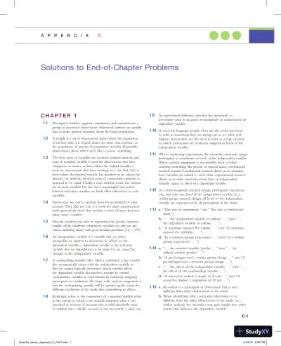
C-1C H A P T E R11.1Descriptive statistics organize, summarize, and communicate agroup of numerical observations. Inferential statistics use sampledata to make general estimates about the larger population.1.2A sample is a set of observations drawn from the populationof interest that, it is hoped, shares the same characteristics asthe population of interest. A population includes all possibleobservations about which we’d like to know something.1.3The four types of variables are nominal, ordinal, interval, andratio. A nominal variable is used for observations that havecategories, or names, as their values. An ordinal variable isused for observations that have rankings (i.e., 1st, 2nd, 3rd) astheir values. An interval variable has numbers as its values; thedistance (or interval) between pairs of consecutive numbers isassumed to be equal. Finally, a ratio variable meets the criteriafor interval variables but also has a meaningful zero point.Interval and ratio variables are both often referred to as scalevariables.1.4Statisticians usescaleas another term for an interval or ratiomeasure. They also usescaleas a word for many measurementtools, particularly those that involve a series of items that test-takers must complete.1.5Discrete variables can only be represented by specific numbers,usually whole numbers; continuous variables can take on anyvalues, including those with great decimal precision (e.g., 1.597).1.6An independent variable is a variable that we eithermanipulate or observe to determine its effects on thedependent variable; a dependent variable is the outcomevariable that we hypothesize to be related to, or caused by,changes in the independent variable.1.7A confounding variable (also called a confound) is any variablethat systematically varies with the independent variable sothat we cannot logically determine which variable affectsthe dependent variable. Researchers attempt to controlconfounding variables in experiments by randomly assigningparticipants to conditions. The hope with random assignment isthat the confounding variable will be spread equally across thedifferent conditions of the study, thus neutralizing its effects.1.8Reliability refers to the consistency of a measure.Validity refersto the extent to which a test actually measures what it wasintended to measure. A measure that is valid absolutely mustbe reliable, but a reliable measure is not necessarily a valid one.1.9An operational definition specifies the operations orprocedures used to measure or manipulate an independent ordependent variable.1.10In everyday language, people often use the wordexperimentto refer to something they are trying out to see what willhappen. Researchers use the term to refer to a type of studyin which participants are randomly assigned to levels of theindependent variable.1.11When conducting experiments, the researcher randomly assignsparticipants to conditions or levels of the independent variable.When random assignment is not possible, such as whenstudying something like gender or marital status, correlationalresearch is used. Correlational research allows us to examinehow variables are related to each other; experimental researchallows us to make assertions about how an independentvariable causes an effect in a dependent variable.1.12In a between-groups research design, participants experienceone, and only one, level of the independent variable. In awithin-groups research design, all levels of the independentvariable are experienced by all participants in the study.1.13a.“This was an experiment.” (not “This was a correlationalstudy.”)b.“. . . the independent variable of caffeine . . .” (not “ . . .the dependent variable of caffeine . . . ”)c.“A university assessed the validity . . .” (not “A universityassessed the reliability . . . ”)d.“In a between-groups experiment . . .” (not “In a within-groups experiment . . . ”)1.14a.“. . . the nominal variable ‘gender’ . . .” (not “. . . theordinal variable ‘gender’ . . .”)b.“A psychologist used a within-groups design . . .” (not “Apsychologist used a between-groups design . . .”)c.“. . . the effects of the independent variable . . .” (not “. . .the effects of the confounding variable . . .”)d.“A researcher studied a sample of 20 rats . . .” (not “Aresearcher studied a population of 20 rats . . .”)1.15a.An outlier is a participant or observation that is verydifferent from other observations in the study.b.When identifying why a particular observation is sodifferent from the other observations in the study (i.e.,outlier analysis), the researcher may gain insight into otherfactors that influence the dependent variable.Solutions to End-of-Chapter ProblemsappendixcNolan3e_interior_Appendix_C_Ch01.indd111/04/146:53 PM

Page 2

Statistics for the Behavioral Sciences Third Edition Solution Manual - Page 2 preview image

Loading page image...

Page 3

Statistics for the Behavioral Sciences Third Edition Solution Manual - Page 3 preview image

Loading page image...

C-2APPENDIX C1.16The sample is the 225 students who completed the survey. Thepopulation is all of the student customers at the bookstore.1.17The sample is the 100 customers who completed the survey.The population is all of the customers at the grocery store.1.18a.130 peopleb.All people living in urban areas in the United Statesc.Descriptive statisticd.Answers may vary, but one way is to sort people intogroups such as “long distance walked,” “medium distancewalked,” and “short distance walked.”e.Answers may vary, but pedometers could be used to measuresteps taken or miles walked, both of which are scale measures.1.19a.73 peopleb.All people who shop in grocery stores similar to the onewhere data were collectedc.Inferential statisticd.Answers may vary, but people could be labeled as having a“healthy diet” or an “unhealthy diet.”e.Answers may vary, but there could be groupings such as“no items,” “a minimal number of items,” “some items,”and “many items.”f.Answers may vary, but the number of items could becounted or weighed.1.20Answers may vary, but on a national level, one could lookat the rate of houses in foreclosure or the amount ofgovernment debt.1.21a.The independent variables are physical distance andemotional distance. The dependent variable is accuracy ofmemory.b.There are two levels of physical distance (within 100 miles and100 miles or farther) and three levels of emotional distance(knowing no one who was affected, knowing people whowere affected but lived, and knowing someone who died).c.Answers may vary, but accuracy of memory could beoperationalized as the number of facts correctly recalled.1.22a.Skin toneb.Severity of facial wrinklesc.Three levels (light, medium, and dark)1.23Both Miguel Induráin and Lance Armstrong could beconsidered outliers because their scores (number of wins) areextreme compared to the typical number of wins by Tour deFrance winners.1.24An outlier analysis of Miguel Induráin and Lance Armstrongmight lead a researcher to identify factors that are critical tosuperior cycling performance.1.25a.The average weight for a 10-year-old girl was 77.4 poundsin 1963 and nearly 88 pounds in 2002.b.No; the CDC would not be able to weigh every singlegirl in the United States because it would be too expensiveand time consuming.c.It is a descriptive statistic because it is a numericalsummary of a sample. It is an inferential statistic becausethe researchers drew conclusions about the population’saverage weight based on this information from a sample.1.26a.The sample is the 60,000 people they studied.b.The researchers would like to generalize their findings to thepopulation of all Norwegians, or perhaps even more broadly.1.27a.Ordinalb.Scalec.Nominal1.28a.Ordinalb.Scalec.Scaled.Scalee.Nominalf.Nominal1.29a.Discreteb.Continuousc.Discreted.Discretee.Continuous1.30a.A reliable test is one that provides consistent results. If youtake the test twice, you should get the same results, anindication of reliability.b.A valid test is one that measures what it intends to measure.This test has the stated intention of measuring personality. If infact it is measuring personality accurately, then it is a valid test.c.There are several possible answers to this question. Thedevelopers of this Web site might, for example, hypothesizethat the region of the world in which one grew up predictsdifferent personality profiles that are based on region.d.The independent variable would be region and thedependent variable would be personality profile.1.31a.The independent variables are temperature and rainfall.Both are continuous scale variables.b.The dependent variable is experts’ ratings. This is a discretescale variable.c.The researchers wanted to know if the wine experts areconsistent in their ratings—that is, if they’re reliable.d.This observation would suggest that Robert Parker’sjudgments are valid. His ratings seem to be measuringwhat they intend to measure—wine quality.1.32a.“Best rapper” is operationalized as those who have thehighest rhyme density.b.Other variables could include ratings of flow and deliverywhen performing, measures of influence or impact, ratingsof storytelling and lyricism, record or song sales, awardswon, number of downloads, critic reviews and ratings,listener ratings, and so on.c.Ranking is an ordinal variable; rhyme density is a scale variable.d.They added cultural relevance and how interesting therapper is to their operational definition.1.33a.Age: teenagers and adults in their 30s; video gameperformance: final score on a video game or averagereaction time on a video game taskb.Spanking: spanking and not spanking; violent behavior:parental measure of child aggression or number ofaggressive acts observed in an hour of play.c.Meetings: go to meetings and participate online; weight loss:measured in pounds or kilograms, or by change in waist sizeNolan3e_interior_Appendix_C_Ch01.indd211/04/146:53 PM

Page 4

Statistics for the Behavioral Sciences Third Edition Solution Manual - Page 4 preview image

Loading page image...

APPENDIX CC-3d.Studying: with others and alone; statistics performance: averagetest score for the semester or overall grade for the semester.e.Beverage: caffeinated and decaffeinated; time to fall asleep:minutes to fall asleep from when the participant goes tobed, or the actual time at which the participant falls asleep.1.34a.The study could use a between-groups research design byassigning half the participants to exercise and half not to exercise.b.Participants could be followed for several months todetermine weight loss before the exercise program, thenstart the exercise program and be followed for severalmonths to determine weight loss after the program.c.There are several possible confounds. In the within-groupsdesign, the participants are having their weight loss tracked,then starting an exercise program, then having their weightloss tracked some more. It is possible that the mere actof tracking weight loss leads participants to implementweight-loss tactics other than exercise and that they startreaping the benefits of these tactics around the time theexercise program begins. Alternatively, it is possible that theno exercise segment occurs in the winter and the exercisesegment occurs in the spring. Many people gain a bit ofweight during the winter and lose weight as summer—andbathing-suit season—approaches. It might be the weather,not the exercise program, that leads to weight loss.1.35a.An experiment requires random assignment to conditions.It would not be ethical to randomly assign some people tosmoke and some people not to smoke, so this research hadto be correlational.b.Other unhealthy behaviors have been associated withsmoking, such as poor diet and infrequent exercise. Theseother unhealthy behaviors might be confounded withsmoking.c.The tobacco industry could claim it was not the smokingthat was harming people, but rather the other activities inwhich smokers tend to engage or fail to engage.d.You could randomly assign people to either a smoking groupor a nonsmoking group, and assess their health over time.1.36a.This research is correlational because participants could not berandomly assigned to be high in individualism or collectivism.b.The sample is the 32 people who tested high forindividualism and the 37 people who tested high forcollectivism.c.Answers may vary, but one hypothesis could be “Onaverage, people high in individualism will have morerelationship conflict than those high in collectivism.”d.Answers may vary, but one way to measure relationshipconflict could be counting the number of disagreements orfights per month.1.37a.This is experimental because students are randomlyassigned to one of the incentive conditions for recycling.b.Answers may vary, but one hypothesis could be “Studentsfined for not recycling will report lower concerns for theenvironment, on average, than those rewarded for recycling.”1.38a.The person would be considered an outlier because his or herscore was far from the scores of all the others in the study.b.Outlier analysis might be useful to find out why this persongained so much despite the exercise program. For example, wasthe person eating much more because he or she incorrectlyassumed the exercise would burn all the extra calories?c.We are looking for any reason that might explain why thisoutlier exists. Is there something about this individual thatprovides evidence for our hypothesis, when, on the face ofit, the outlier seems to discredit our hypothesis?1.39a.The person who took 3 minutes would be considered anoutlier because the person’s response time was much moreextreme than any of the response times exhibited by theother participants.b.In this case, the researcher might look to see if theparticipant was slow on other experimental tasks as wellor if there was some other independent evidence that theparticipant did not take the experimental task seriously.1.40a.Participants in the Millennium Cohort Studyb.Parents in the United Kingdom, or possibly all parents globallyc.This is a correlational study, as individuals were notrandomly assigned to the condition of being a marriedcouple or a cohabiting couple.d.Marital status—married or cohabitinge.Length of relationshipf.There are several possible answers to this question. Forexample, economic status or financial well-being may bea confounding factor, as those who are more likely tohave the money to marry and raise a family may havefewer life stressors than those who have less money, donot marry, and choose to cohabit. This variable could beoperationalized and measured via household income.1.41a.Researchers could have randomly assigned some peoplewho are HIV-positive to take the oral vaccine and otherpeople who are HIV-positive not to take the oral vaccine.The second group would likely take a placebo.b.This would have been a between-groups experimentbecause the people who are HIV-positive would have beenin only one group: either vaccine or no vaccine.c.This limits the researchers’ ability to draw causal conclusionsbecause the participants who received the vaccine may havebeen different in some way from those who did not receivethe vaccine.There may have been a confounding variable thatled to these findings. For example, those who received thevaccine might have had better access to health care and bettersanitary conditions to begin with, making them less likely tocontract cholera regardless of the vaccine’s effectiveness.d.The researchers might not have used random assignmentbecause it would have meant recruiting participants, likelyimmunizing half, then following up with all of them. Theresearchers likely did not want to deny the vaccine topeople who were HIV-positive because they might havecontracted cholera and died without it.1.42a.Ability level, graduate level (high school versus university), raceb.Wagesc.12,000 men and women in the United States who were14–22 years old in 1979d.High school and college graduate men and women in theUnited Statese.Participants were studied over time to measure changeduring that period.f.Age could be a confounding variable, as those who areolder will have greater exposure to the various areasmeasured via the AFQT, in addition to the education theyreceived at the college level.Nolan3e_interior_Appendix_C_Ch01.indd311/04/146:53 PM

Page 5

Statistics for the Behavioral Sciences Third Edition Solution Manual - Page 5 preview image

Loading page image...

C-4APPENDIX Cg.Ability could be operationalized by having managers rateeach participant’s ability to perform his or her job. Anotherway ability could be operationalized is via high school andcollege GPA or a standardized ability test.1.43a.A “good charity” is operationally defined as one thatspends more of its money for the cause it is supportingand less for fundraising or administration.b.The rating is a scale variable, as it has a meaningful zeropoint, has equal distance between intervals, and is continuous.c.The tier is an ordinal variable, as it involves ranking theorganizations into categories (1st, 2nd, 3rd, 4th, or 5th tier)and it is discrete.d.The type of charity is a nominal variable, as it uses namesor categories to classify the values (e.g., health and medicalneeds) and it is discrete.e.Measuring finances is more objective and easier to measurethan some of the criteria mentioned by Ord, such asimportance of the problem and competency and honesty.f.Charity Navigator’s ratings are more likely to be reliablethan GiveWell’s ratings because they are based on anobjective measure. It is more likely that different assessorswould come up with the same rating for CharityNavigator than for GiveWell.g.GiveWell’s ratings are likely to be more valid than CharityNavigator’s, provided that they can attain some level ofreliability. GiveWell’s more comprehensive rating systemincorporates a better-rounded assessment of a charity.h.This would be a correlational study because donation funds,the independent variable, would not be randomly assignedbased on country but measured as they naturally occur.i.This would be an experiment because the levels of donationfunds, the independent variable, are randomly assigned todifferent regions to determine the effect on death rate.C H A P T E R22.1Raw scores are the original data, to which nothing hasbeen done.2.2To create a frequency table: (1) Determine the highest andlowest scores. (2) Create two columns; label the first with thevariable name and label the second “Frequency.” (3) List the fullrange of values that encompasses all the scores in the data set, fromlowest to highest, even those for which the frequency is 0. (4) Countthe number of scores at each value, and write those numbers inthe frequency column.2.3A frequency table is a visual depiction of data that showshow often each value occurred; that is, it shows how manyscores are at each value.Values are listed in one column, andthe numbers of individuals with scores at that value are listedin the second column. A grouped frequency table is a visualdepiction of data that reports the frequency within each giveninterval, rather than the frequency for each specific value.2.4Statisticians might useintervalto describe a type of variable.Interval variables have numbers as their values, and thedistance (or interval) between numbers is assumed to be equal.Statisticians might also useintervalto refer to the range of valuesto be used in a grouped frequency table, histogram, or polygon.2.5Bar graphs typically provide scores for nominal data, whereashistograms typically provide frequencies for scale data. Also,the categories in bar graphs do not need to be arranged in aparticular order and the bars should not touch, whereas theintervals in histograms are arranged in a meaningful order(lowest to highest) and the bars should touch each other.2.6Thex-axis is typically labeled with the name of the variableof interest. They-axis is typically labeled “Frequency.”2.7A histogram looks like a bar graph but is usually used todepict scale data, with the values (or midpoints of intervals)of the variable on thex-axis and the frequencies on they-axis. A frequency polygon is a line graph, with thex-axisrepresenting values (or midpoints of intervals) and they-axisrepresenting frequencies; a dot is placed at the frequency foreach value (or midpoint), and the points are connected.2.8Visual displays of data often help us see patterns that are notobvious when we examine a long list of numbers. They helpus organize the data in meaningful ways.2.9In everyday conversation, you might use the worddistributionina number of different contexts, from the distribution of food toa marketing distribution.A statistician would usedistributiononly todescribe the way that a set of scores, such as a set of grades, isdistributed. A statistician is looking at the overall pattern of thedata—what the shape is, where the data tend to cluster, andhow they trail off.2.10A normal distribution is a specific frequency distribution thatis a bell-shaped, symmetric, unimodal curve.2.11With positively skewed data, the distribution’s tail extends to theright, in a positive direction, and with negatively skewed data,the distribution’s tail extends to the left, in a negative direction.2.12A floor effect occurs when there are no scores below a certainvalue; a floor effect leads to a positively skewed distributionbecause the lower part of the distribution is constrained.2.13A ceiling effect occurs when there are no scores above a certainvalue; a ceiling effect leads to a negatively skewed distributionbecause the upper part of the distribution is constrained.2.14A stem-and-leaf plot retains information about every uniquedata point in a set, whereas a histogram does not. Additionally,it is easy to create side-by-side stem-and-leaf plots for differentgroups to compare their distributions. Such a side-by-sidecomparison of groups is not as easy to do with histograms.2.15A stem-and-leaf plot is much like a histogram in that itconveys how often different values in a data set occur. Also,when a stem-and-leaf plot is turned on its side, it has thesame shape as a histogram of the same data set.2.164.98% and 2.27%2.1717.95% and 40.67%2.183.69% and 18.11% are scale variables, both as counts andas percentages.2.190.10% and 96.77%2.201,889.00, 2.65, and 0.082.210.04, 198.22, and 17.892.22a.The full range is the maximum (27) minus the minimum(0), plus 1, which equals 28.b.Fivec.The intervals would be 0–4, 5–9, 10–14, 15–19, 20–24, and 25–29.Nolan3e_interior_Appendix_C_Ch01.indd411/04/146:53 PM

Page 6

Statistics for the Behavioral Sciences Third Edition Solution Manual - Page 6 preview image

Loading page image...

APPENDIX CC-52.23The full range of data is 68 minus 2, plus 1, or 67. The range(67) divided by the desired seven intervals gives us an intervalsize of 9.57, or 10 when rounded. The seven intervals are: 0–9,10–19, 20–29, 30–39, 40–49, 50–59, and 60–69.2.2437.5, 52.5, and 67.52.2526 shows2.26Twelve countries had between 2 and 10 first- or second-placeWorld Cup finishes.2.27Serial killers would create positive skew, adding high numbersof murders to the data that are clustered around 1.2.28People convicted of murder are assumed to have killed at leastone person, so observations below one are not seen, whichcreates a floor effect.2.29a.For the college population, the range of ages extendsfarther to the right (with a larger number of years) than tothe left, creating positive skew.b.The fact that youthful prodigies have limited access to collegecreates a sort of floor effect that makes low scores less possible.2.30a.Assuming that most people go for the maximum numberof friends, for the range of Facebook friends, the numberof friends extends farther to the left (with fewer numberof friends) than to the right, creating a negative skew.b.The fact that Facebook cuts off or limits the number offriends to 5000 means there is a ceiling effect that makeshigher scores impossible.2.31a.The stem-and-leaf plot is depicted below:355568888300133344442577888920034416881030501b.This stem-and-leaf plot depicts a negatively skewed distribution.2.32a.The stem-and-leaf plot is depicted below:400055300005555555200555b.This stem-and-leaf plot depicts a symmetric distribution.2.33a.PERCENTAGEFREQUENCYPERCENTAGE1015.26900.00800.00700.00600.005210.534210.533421.052421.051526.32015.26b.In10.53% of these schools, exactly 4% of the studentsreported that they wrote between 5 and 10 twenty-pagepapers that year.c.This is not a random sample. It includes schools that choseto participate in this survey and opted to have their resultsmade public.d.1236879540 0 13FrequencyPercent of students57911e.Onef.The data are clustered around 1% to 4%, with a highoutlier, 10%.2.34a.YEARS TO COMPLETEFREQUENCY1521411311211111029489711610b.30c.A grouped frequency table is not necessary here. Thesedata are relatively easy to interpret in the frequency table.Grouped frequency tables are useful when the list of data islong and difficult to interpret.d.These data are clustered around 6 to 8 years, with a long tailof data out to a greater number of years to complete. Thesedata show positive skew.Nolan3e_interior_Appendix_C_Ch02.indd511/04/146:53 PM

Page 7

Statistics for the Behavioral Sciences Third Edition Solution Manual - Page 7 preview image

Loading page image...

C-6APPENDIX Ce.2143765111210980102345678910111214161513YearsFrequencyd.e.There are no unusual scores, as the distribution is fairlyuniform with frequencies between 6 and 13. The center ofthe distribution seems to be in the 20–49 range.2.36a.INTERVALFREQUENCY60–69150–59540–49930–39520–29810–192214376511121413109800515253545556575FrequencyAcceptance ratef.Eight2.35a.INTERVALFREQUENCY60–69950–59840–491330–391320–29810–19120–97b.There are many possible answers to this question. Forexample, we might ask whether the prestige of the universityor the region of the country is a factor in acceptance rate.c.21437651112141310980 0 5152535455565Acceptance rateFrequencyNolan3e_interior_Appendix_C_Ch02.indd611/04/146:53 PM

Page 8

Statistics for the Behavioral Sciences Third Edition Solution Manual - Page 8 preview image

Loading page image...

APPENDIX CC-7b.21437651098015502535455565Number of winsFrequencyc.The summary will differ for each student but should include thefollowing information:The data appear to be roughly symmetric.d.With so few data points, it is easy to view patterns in thedata without grouping the data into intervals.2.37a.Extroversion scores are most likely to have a normaldistribution. Most people would fall toward the middle, withsome people having higher levels and some having lower levels.b.The distribution of finishing times for a marathon is likelyto be positively skewed.The floor is the fastest possible time,a little over 2 hours; however, some runners take as longas 6 hours or more. Unfortunately for the very, very slowbut unbelievably dedicated runners, many marathons shutdown the finish line 6 hours after the start of the race.c.The distribution of numbers of meals eaten in a dining hall ina semester on a three-meal-a-day plan is likely to be negativelyskewed.The ceiling is three times per day, multiplied by thenumber of days; most people who choose to pay for the fullplan would eat many of these meals. A few would hardly evereat in the dining hall, pulling the tail in a negative direction.2.38a.You would present individual data values because the fewcategories of eye color would result in a readable list. Afrequency table would be most appropriate.b.You would present grouped data because it is possible foreach person to use a different number of minutes and sucha long list would be unreadable. A grouped frequency table,histogram, or frequency polygon would be most appropriate.c.You would present grouped data because time to completecarried out to seconds would produce too many uniquenumbers to organize meaningfully without groupings. Agrouped frequency table, histogram, or frequency polygonwould be most appropriate.d.You would present individual data values because numberof siblings tends to take on limited values. A frequency table,histogram, or frequency polygon would be most appropriate.2.39INTERVALFREQUENCY18–20215–17612–1429–1136–873–582.40The stem-and-leaf plot is depicted below:3320026189022.41The stem-and-leaf plot is depicted below:6050136740022344893137792335679991892.42a.A histogram of grouped frequenciesb.Approximately 32c.Approximately 27d.Two questions we might ask are (1) How close is theperson to those photographed?, and (2)What mightaccount for the two peaks in these data?e.1052015353025001234Number of television setsPercentagef.246801.54.507.5 10.5 13.5 16.5 19.5Number of people picturedFrequencyg.The data have two high points around 3–9 and 15–18. Wecan see that the data are asymmetric to the right, creatingpositive skew.h.The stem-and-leaf plot is depicted below:201012355667780013333345567777889Nolan3e_interior_Appendix_C_Ch02.indd711/04/146:53 PM

Page 9

Statistics for the Behavioral Sciences Third Edition Solution Manual - Page 9 preview image

Loading page image...

C-8APPENDIX Ci.These data reflect a floor effect because most of theobservations are clustered on the lower end of the distributionbetween 0 and 9.This floor effect is likely caused by the factthat people cannot have fewer than 0 pictures of others.2.43a.MONTHSFREQUENCYPERCENTAGE1215110010159158007156155004153420221013150525b.c.d.INTERVALFREQUENCY10–14 months25–9 months30–4 months15012345102345678910 11 12 13Frequency23451602103145678910 11 12 13MonthsFrequencye.123654089101312151411702.557.512.51015MonthsFrequencyf.g.These data are centered around the 3-month period, withpositive skew extending the data out to the 12-month period.h.The bulk of the data would need to be shifted from the3-month period to approximately 12 months, so thewomen who have breast-fed for 3 months so far might bethe focus of attention. Perhaps early contact at the hospitaland at follow-up visits after birth would help encouragemothers to breast-feed, and to breast-feed longer. Onecould also consider studying the women who create thepositive skew to learn what unique characteristics orknowledge they have that influenced their behavior.2.44a.The column for faculty shows a high point from 0–7 friends.b.The column for students shows two high points around 4–11and 16–23, with some high outliers creating positive skew.c.The independent variable would be status, with two levels(faculty, student).d.The dependent variable would be number of friends.e.A confounding variable could be age, as faculty areolder than students and tend to be less involved in socialactivities or situations where making friends is common.f.The dependent variable could be operationalized as thenumber of people who appear in photographs on display indorm rooms and offices across campus, as was done for this234516879111213141015002.52.557.51012.51517.5MonthsFrequencyNolan3e_interior_Appendix_C_Ch02.indd811/04/146:53 PM

Page 10

Statistics for the Behavioral Sciences Third Edition Solution Manual - Page 10 preview image

Loading page image...

APPENDIX CC-9study. There are several additional ways these data could beoperationalized. One way would be to record the numberof Facebook friends each person has. Another way wouldbe to count the number of friends each person reportsinteracting with on a regular basis. This latter method ofmeasuring number of friends is more likely to reveal thequality of friendship via the amount of interaction.2.45a.FORMERSTUDENTS NOWIN TOP JOBSFREQUENCYPERCENTAGE1311.851200.001100.001000.00911.85835.56747.41659.265916.674814.8132342.59b.c.d.This distribution is positively skewed.e.The researchers operationalized the variable of mentoringsuccess as numbers of students placed into top professorial5101520250304125678101112139Number of students mentored by each different professorFrequency5101520250 0Number of students mentored by each different professorFrequency123456789 10 11 1214161513positions. There are many other ways this variable couldhave been operationalized. For example, the researchersmight have counted numbers of student publications whilein graduate school or might have asked graduates to ratetheir satisfaction with their graduate mentoring experiences.f.The students might have attained their positions asprofessors because of the prestige of their advisor, notbecause of his mentoring.g.There are many possible answers to this question. Forexample, the attainment of a top professor position mightbe predicted by the prestige of the institution, the numberof publications while in graduate school, or the graduatestudent’s academic ability.C H A P T E R33.1The five techniques for misleading with graphs are the biasedscale lie, the sneaky sample lie, the interpolation lie, theextrapolation lie, and the inaccurate values lie.3.2(1) Organize the data by participant; each participant willhave two scores, one on each scale variable. (2) Label thehorizontalx-axis with the name of the independent variableand its possible values, starting with 0 if practical. (3) Labelthe verticaly-axis with the name of the dependent variableand its possible values, starting with 0 if practical. (4) Make amark on the graph above each study participant’s score on thex-axis and across from his or her score on they-axis.3.3To convert a scatterplot to a range-frame, simply erase the axesbelow the minimum score and above the maximum score.3.4A linear relation between variables means that the relationbetween variables is best described by a straight line.3.5With scale data, a scatterplot allows for a helpful visual analysisof the relation between two variables. If the data points appearto fall approximately along a straight line, the variables mayhave a linear relation. If the data form a line that changesdirection along its path, the variables may have a nonlinearrelation. If the data points show no particular relation, it ispossible that the two variables are not related.3.6A line graph is used to illustrate the relation betweentwo scale variables. One type of line graph is based on ascatterplot and allows us to construct a line of best fit thatrepresents the predictedyscores for eachxvalue. A secondtype of line graph allows us to visualize changes in the valueson they-axis over time. A time plot, or time series plot, isa specific type of line graph. It is a graph that plots a scalevariable on they-axis as it changes over an increment of time(e.g., second, day, century) recorded on thex-axis.3.7A bar graph is a visual depiction of data in which the independentvariable is nominal or ordinal and the dependent variable is scale.Each bar typically represents the mean value of the dependentvariable for each category. A Pareto chart is a specific type of bargraph in which the categories along thex-axis are ordered fromhighest bar on the left to lowest bar on the right.3.8Bar graphs typically depict summary statistics, such asfrequencies or averages, for several different levels of one ormore nominal or ordinal independent variables. Histogramstypically depict frequencies for different values of one scalevariable. Bars represent counts or percentages for different valuesof a scale variable or for different intervals of that scale variable.Nolan3e_interior_Appendix_C_Ch02.indd911/04/146:53 PM

Page 11

Statistics for the Behavioral Sciences Third Edition Solution Manual - Page 11 preview image

Loading page image...

C-10APPENDIX C3.9A pictorial graph is a visual depiction of data typically usedfor a nominal independent variable with very few levels(categories) and a scale dependent variable. Each level usesa picture or symbol to represent its value on the scaledependent variable. A pie chart is a graph in the shape ofa circle, with a slice for every level. The size of each slicerepresents the proportion (or percentage) of each category.In most cases, a bar graph is preferable to a pictorial graphor a pie chart.3.10Bar graphs are straightforward presentations of data, whereasthe elements of pictorial graphs and pie charts can oftendistract from the data being presented. Also, mistakes inpresentation style are much more common for pictorial graphsand pie charts than for bar graphs.3.11The independent variable typically goes on the horizontalx-axis and the dependent variable goes on the verticaly-axis.3.12Whenever possible, graph axes should start at 0, althoughsometimes it is not practical to start at 0. For example, whenthe data do not contain low values (and including 0 wouldminimize the depiction of the actual data), cut marks shouldbe used to indicate axes that do not start at 0.3.13Moiré vibrations are any visual patterns that create adistracting impression of vibration and movement. A grid isa background pattern, almost like graph paper, on which thedata representations, such as bars, are superimposed. Ducks arefeatures of the data that have been dressed up to be somethingother than merely data.3.14Geographic information systems are particularly powerful foranalyzing demographic patterns or demographic differencesin a variable. Knowing how several variables change overgeographic regions could lead researchers to detect importantrelations among variables.3.15Like a traditional scatterplot, the locations of the points on thebubble graph simultaneously represent the values that a singlecase (or country) has on two scale variables. The graph as awhole depicts the relation between these two variables.3.16Unlike a scatterplot, this bubble graph depicts two additionalvariables, for a total of four variables. The bubble graph allowsthe reader to evaluate the relations among multiple variablesat the same time and can depict more complex relations thancan the traditional scatterplot.3.17Total dollars donated per year is scale data. A time plot wouldnicely show how donations varied across years.3.18Sorting people into the categories of “alumni who donatedmoney” and “alumni who did not donate money” createsnominal data. We would use a bar graph to depict thenumbers of alumni who did and did not donate.3.19a.The independent variable is gender and the dependentvariable is video game score.b.Nominalc.Scaled.The best graph for these data would be a bar graphbecause there is a nominal independent variable and a scaledependent variable.3.20Nonlinear, because the data change direction around 4.00 onthex-axis.3.21Linear, because the data could be fit with a line drawn fromthe upper-left to the lower-right corner of the graph.3.22These graphs are missing titles and axis labels. The axes arealso missing 0 values.3.23a.Bar graphb.Line graph; more specifically, a time plotc.They-axis should go down to 0.d.The lines in the background are grids, and the three-dimensional effect is a type of duck.e.3.20%, 3.22%, 2.80%f.If they-axis started at 0, all of the bars would appear to beabout the same height. The differences would be minimized.3.24These data have a minimum value of 273 and a maximumvalue of 342. Because the minimum value is far from 0, it isnot practical to have the axis start at 0, so cut marks would beused. (However, we would include the full range of data0 to342if omitting some of these numbers would be misleading.)We might then include every 10th value, starting at 270:2702802903003103203303403503.25The minimum value is 0.04 and the maximum is 0.36, so theaxis could be labeled from 0.00 to 0.40. We might choose tomark every 0.05 value:0.000.050.100.150.200.250.300.350.403.26a.The highest life expectancy is 82 years. The fertility rateassociated with the highest life expectancy is 0.96.b.Yes, this seems to be a linear relation, with the data fittinga line moving from the upper-left to the lower-rightcorner of the graph. As the fertility rate increases, the lifeexpectancy at birth decreases.3.27The relation between physical health and positive emotionsseems to be positive, with the data fitting a line moving fromthe lower-left to the upper-right corner of the graph. Aspositive emotions increase, self-reported physical health alsotends to increase.3.28The relation between positive emotions and GDP seems tobe positive, where countries with larger GDPs (represented bylarger, yellower dots) are more concentrated in the upper-rightcorner of the graph and those with smaller GDPs (representedby smaller, darker red dots) are more concentrated in themiddle to lower-left corner of the graph. As GDP increases,positive emotions tend to increase.3.29a.The independent variable is height and the dependentvariable is attractiveness. Both are scale variables.b.The best graph for these data would be a scatterplot(which also might include a line of best fit if the relation islinear) because there are two scale variables.c.It would not be practical to start the axis at 0. With thedata clustered from 58 to 71 inches, a 0 start to the axiswould mean that a large portion of the graph would beempty. We would use cut marks to indicate that the axisdid not include all values from 0 to 58. (However, wewould include the full range of data0 to 71if omittingsome of these numbers would be misleading.)3.30a.The independent variable is time (i.e., week) and thedependent variable is mean depression level.b.Both variables are scale.Nolan3e_interior_Appendix_C_Ch03.indd1011/04/147:03 PM

Page 12

Statistics for the Behavioral Sciences Third Edition Solution Manual - Page 12 preview image

Loading page image...

APPENDIX CC-11c.The best graph for these data would be a time plotbecause the social worker is tracking depression levels overa period of time (20 weeks).3.31a.The independent variable is country and the dependentvariable is male suicide rate.b.Country is a nominal variable and suicide rate is a scalevariable.c.The best graph for these data would be a bar graph or aPareto chart. Because there are six categories or countriesto list along thex-axis, it may be best to arrange them inorder from highest to lowest using a Pareto chart.d.A time series plot could show year on thex-axis andsuicide rate on they-axis. Each country would berepresented by a different color line.3.32a.b.For the most part, the points on the scatterplot do notseem to indicate any particular relation, whether linear orcurvilinear. Low-mileage days (50 to 70 miles) have somelow-climb and some high-climb days, and mid-mileage days(90 to 110 miles) have some low-climb and some high-climbdays. Only the two very long mileage days (around 120miles) have low climbs, perhaps indicating a tiny relation.c.The cyclists experience both the mileage and climbs asdifficult and tend to notice days on which both are high.The organizers want to convince cyclists to sign up andpay the trip costs so they can make money; a promise thatlong mileage days won’t have big climbs helps them recruitcyclists. The staff have no vested interest either way.3.33a.90001000200030004000500060007000800006050809070130120110100MilesClimbRelation Between Cycling Daily Mileage andCycling Daily Climb in Feet121086420501520CanadaUnited KingdomGermanyJapanUnited StatesItalyFrance103025Percentage with university degreeGDPRelation Between Percentage with University Degreeand GDP (in trillions of $US)b.The percentage of residents with a university degreeappears to be related to GDP. As the percentage with auniversity degree increases, so does GDP.c.It is possible that an educated populace has the skills tomake that country productive and profitable. Conversely, itis possible that a productive and profitable country has themoney needed for the populace to be educated.3.34a.b.These data suggest that, although there are somefluctuations, a slight increase in organ donation seems tohave taken place between 2001 and 2010.c.There are many possible answers to this question.You might,for instance, be interested in how characteristics of families ortypes of deaths distinguish between agreeing to and decliningto donate.You might also be interested in what changes overtime may have correlated with the slight increase in donationrates; for example, has there been an increase in public serviceannouncements encouraging organ donation?3.35a.The independent variable is the academic institution. It isnominal; the levels are the 10 colleges.b.The dependent variable is alumni donation rate. It is ascale variable; the units are percentages, and the range ofvalues is from 50.2 to 62.6.c.The defaults will differ, depending on which software isused. Here is one example.70.00%60.00%50.00%40.00%30.00%20.00%10.00%0.00%Princeton University (NJ)Thomas Aquinas College (CA)Carleton College (MN)Williams College (MA)Amherst College (MA)Centre College (KY)Middlebury College (VT)Davidson College (NC)College of the Holy Cross (MA)Bowdoin College (ME)d.The redesigns will differ, depending on which software isused. In this example, we added a clear title and labeled they-axis (being sure that it reads from left to right).We alsoeliminated the unnecessary lines in the background and thedecimal places of each number on they-axis.1502001 2002 2003 2004 2005 2006 2007 2008 2009 2010510Donation rateper millionpopulationYearOrgan Donation Rates per Million in Canada,2001–2010Nolan3e_interior_Appendix_C_Ch03.indd1111/04/147:03 PM

Page 13

Statistics for the Behavioral Sciences Third Edition Solution Manual - Page 13 preview image

Loading page image...

C-12APPENDIX C0%10%20%30%40%50%60%70%Princeton University (NJ)Thomas Aquinas College (CA)Carleton College (MN)Williams College (MA)Amherst College (MA)Centre College (KY)Middlebury College (VT)Davidson College (NC)College of the Holy Cross (MA)Bowdoin College (ME)Alumnidonationrate(percent)Alumni Donation Rates for Top 10 Colleges and Universitiese.There are many possible answers to this question. Onemight want to identify characteristics of alumni whodonate, methods of soliciting donations that result in thebest outcomes, or characteristics of universities that havethe highest rates.f.Pictures could be used instead of bars. For example, dollarsigns might be used to represent the donation rate for eachcollege.g.If the dollar signs become wider as they get taller, as oftenhappens with pictorial graphs, the overall size would beproportionally larger than the increase in donation rate itis meant to represent. A bar graph is not subject to thisproblem because graphmakers are not likely to make barswider as they get taller.3.36a.A Pareto chart is organized from the highest bar to thelowest bar—in this case, from highest GDP per capita tolowest GDP per capita—whereas a bar graph might beorganized with the countries listed alphabetically from leftto right.b.The Pareto chart allows us to make comparisons moreeasily than does the bar graph. Moreover, we can very easilyidentify the countries with the highest and lowest GDP.3.37a.One independent variable is time frame; it has two levels:1945–1950 and 1996–1998. The other independentvariable is type of graduate program; it also has two levels:clinical psychology and experimental psychology.b.The dependent variable is percentage of graduates whohad a mentor while in graduate school.c.100806040200ClinicalExperimentalType of psychology graduate programPercentagePercentage of Mentoring by Time Frame andType of Psychology Graduate Program1945–19501996–1998d.These data suggest that clinical psychology graduatestudents were more likely to have been mentored if theywere in school in the 1996–1998 time frame than ifthey were in school during the 1945–1950 time frame.There does not appear to be such a difference amongexperimental psychology students.e.This was not a true experiment. Students were notrandomly assigned to time period or type of graduateprogram.f.A time series plot would be inappropriate with so few datapoints. It would suggest that we could interpolate betweenthese data points. It would suggest a continual increasein the likelihood of being mentored among clinicalpsychology students, as well as a stable trend, albeit at ahigh level, among experimental psychology students.g.The story based on two time points might be falselyinterpreted as a continual increase of mentoring ratesfor the clinical psychology students and a plateau for theexperimental psychology students. The expanded dataset suggests that the rates of mentoring have fluctuatedover the years. Without the four time points, we mightbe seduced by interpolation into thinking that the twoscores represent the end points of a linear trend. We cannotdraw conclusions about time points for which we have nodata—especially when we have only two points, but evenwhen we have more points.3.38A pie chart would include the four percentages as slices, but itmight be difficult to make comparisons, particularly betweenpercentages similar in size (e.g., 9% and 5%). A bar graphallows for easier comparisons among categories than does apie chart.3.39a.The details will differ, depending on the software used.Here is one example.CurrentRecentFormer0102030405060708090100Series 1b.The default options that students choose to overridewill differ. For the bar graph on the next page, we(1) added a title, (2) labeled thex-axis, (3) labeled they-axis,(4) rotated they-axis label so that it reads from left to right,and (5)eliminated the unnecessary key.Nolan3e_interior_Appendix_C_Ch03.indd1211/04/147:03 PM

Page 14

Statistics for the Behavioral Sciences Third Edition Solution Manual - Page 14 preview image

Loading page image...

APPENDIX CC-13100402080600CurrentRecentFormerPercentageType of studentPercentage Satisfied with Graduate AdvisorsAmong Current Students, Recent Graduates, andFormer Students Who Did Not Complete a PhD3.40a.The details will differ, depending on the software used.Here is one example.“World’s deepest”trash binRegulartrash bin01020304050607080Series 1b.The default options that students choose to override willdiffer. For the bar graph here, we (1) added a title, (2)labeled thex-axis, (3) labeled they-axis, (4) rotated they-axis, so that it reads from left to right, and (5) eliminatedthe unnecessary key.Kilogramsof trashType of trash binType of Trash Bin and Kilogramsof Trash“World’s deepest”trash binRegulartrash bin010203040506070803.41a.The graph is a scatterplot: individual points are identified fortwo scale variables—academic standing and “hotness.”b.The variables are academic standing and “hotness.”c.The graph could be redesigned to get rid of moirévibrations, such as the colored background; and the grid(the background pattern of graph paper) and duck (thewoman in the background image) could be eliminated.3.42The examples will differ for each student. Correct answers willinclude the following types of variables.a.Frequency polygon: one scale variable; for example, on thex-axis, times for rats to complete a maze, and on they-axis,frequencies for each timeb.Line graph (line of best fit): two scale variables; forexample, on thex-axis, hours of maze-training for rats, andon they-axis, predicted times for rats to complete a mazec.Bar graph (one independent variable): one nominal orordinal independent variable, such as gender of rat, on thex-axis, and one scale dependent variable, such as time tocomplete a maze, on they-axisd.Scatterplot: two scale variables; for example, on thex-axis,hours of maze-training for rats, and on they-axis, times forrats to complete a mazee.Time series plot: one time-related independent variable,such as year, on thex-axis, and one scale dependentvariable, such as mean GPA of incoming students, on they-axisf.Pie chart: Trick question! Don’t use one; use a bar graphinstead.g.Bar graph (two independent variables): two nominal orordinal independent variables, such as gender of rat andreinforcement schedule for rat, on thex-axis, and a scaledependent variable, such as time to complete a maze, onthey-axis3.43Each student’s advice will differ. The following are examples ofadvice.a.Business and women: Eliminate all the pictures,including the woman, piggy banks, the dollar signs in thebackground, and the icons to the right (e.g., house). Thetwo bars near the top could mislead us into thinking theyindicated quantity, even though they are the same lengthfor two different median wages. Either eliminate the barsor size them so that they are appropriate to the dollarsthey represent. Ideally, the two median wages would bepresented in a bar graph. Eliminate unnecessary words (e.g.,“The Mothers of Business Invention”).b.Workforce participation: Eliminate all the pictures. A fallingline in the art shown indicates anincreasein percentage;notice that 40% is at the top and 80% is at the bottom.Make they-axis go from highest to lowest, starting from 0.Make the lines easier to compare by eliminating the three-dimensional effect. Make it clear where the data point foreach year falls by including a tick mark for each numberon thex-axis.3.44The articles and subsequent responses will be different foreach student.3.45a.The graph proposes that Type I regrets of action areinitially intense but decline over the years, while Type IIregrets of inaction are initially mild but become moreintense over the years.Nolan3e_interior_Appendix_C_Ch03.indd1311/04/147:03 PM

Page 15

Statistics for the Behavioral Sciences Third Edition Solution Manual - Page 15 preview image

Loading page image...

C-14APPENDIX Cb.There are two independent variables: type of regret(a nominal variable) and age (a scale variable).There isone dependent variable: intensity of regrets (also a scalevariable).c.This is a graph of a theory. No data have been collected,so there are no statistics of any kind.d.The story that this theoretical relation suggests is thatregrets over things a person has done are intense shortlyafter the actual behavior but decline over the years. Incontrast, regrets over things a person has not done butwishes they had are initially low in intensity but becomemore intense as the years go by.3.46a.This is a time plot. The researchers chose this type ofgraph because they wanted to show changes in the numberof psychology degrees over time.b.This graph suggests a fairly large increase in bachelor’sdegrees over time, with smaller increases in master’s degreesand doctoral degrees.c.There are two independent variables. One is type ofdegree, with three levels: bachelor’s, master’s, and doctoral.It could be considered ordinal. The other independentvariable is year; it is a scale variable. The dependent variableis number of psychology degrees; it is also a scale variable.d.There are several possible answers to this question. Forexample, they-axis starts at 0, there is a clear title, and alllabels read from left to right.e.There are several possible answers to this question. Forexample, the graph creator should have labeled thex-axis.They-axis is too “busy”; intervals of 10,000 would bebetter.f.There are several possible answers to this question. Forexample, we could track percentage out of all such degrees(e.g., percentage of psychology bachelor’s degrees conferredout ofallbachelor’s degrees conferred).g.There are several possible answers to this question.For example, we might examine what types of careerspsychology undergraduates pursue that do not require amaster’s or doctoral degree in psychology.3.47a.When first starting therapy, the client showed a decline, asmeasured by the Mental Health Index (MHI). After 8 weeksof therapy, this trajectory reversed and there was a week-to-week improvement in the client’s MHI.b.There are many possible answers. For example, theinitial decline in the client’s MHI may have been due todifficulties in adapting to therapy that the client overcamewhile working with the therapist. Alternatively, it may bethat the client initially entered therapy because of difficultlife circumstances that continued through the first weeks oftherapy but resolved after several weeks.c.Because the client is not beneath the failure boundary, andbecause the client experienced improvement over the lastfew weeks of therapy, it may be beneficial for the client tocontinue in therapy.3.48a.Density of traffic is represented by the thickness ofthe colored lines across the roads. The flow of traffic isrepresented by the color of the lines.b.Answers to this question will vary, depending on the timeof day and the exact traffic conditions.c.This interactive graph allows anyone to see up-to-the-minute local, regional, and national traffic conditions.Traditional graphing techniques do not allow such up-to-date information on demand.3.49a.Data can almost always be presented more clearly in a bargraph or table than in a pie chart.b.Answers to this question should include revising the datato add up to 100%, removing chartjunk (e.g., colors,shading, background images, etc.), and more clearly labelingcategories with candidate names only. The graph alsoshould not have 3-D features.3.50a.This is a bar graph.b.Variables are boat (levels:Titanicversus other ships),passenger type (levels: women, children, men, crew, captain),survival rate, and death rate.c.No, both survival rate and death rate are not needed, asthese two numbers add up to 100% for each passengertype. Both rates could have been included to either provideall relevant data, or to overemphasize the death rates incomparison to the survival rates.d.This graph is visualizing the different death and survivalrates among various passenger types on theTitanicversusother ships in the study. Though women and children hadhigher survival rates, and lower death rates, than men, crew,and captain on theTitanic, the opposite is true for theother 16 ships in the study. Thus, it seems that theTitanicwas not the norm for passenger survival of shipwrecks, andit was not typical for women and children to be saved first.3.51a.The independent variable is song type, with two levels:romantic song and nonromantic song.b.The dependent variable is dating behavior.c.This is a between-groups study because each participant isexposed to only one level or condition of the independentvariable.d.Dating behavior was operationalized by giving one’s phonenumber to an attractive person of the opposite sex. Thismay not be a valid measure of dating behavior, as we donot know if the participant actually intended to go ona date with the researcher. Giving one’s phone numbermight not necessarily indicate an intention to date.e.We would use a bar graph because there is one nominalindependent variable and one scale dependent variable.f.The default graph will differ, depending on which softwareis used. Here is one example:Romantic songNonromantic song0102030405060%Nolan3e_interior_Appendix_C_Ch03.indd1411/04/147:03 PM

Page 16

Statistics for the Behavioral Sciences Third Edition Solution Manual - Page 16 preview image

Loading page image...

APPENDIX CC-15g.The default options that students choose to override willdiffer. Here is one example.3.52a.Sunday at midnightb.Saturday at 9a.m.c.Are people happiest on Saturdays? The independentvariable is day of the week. The dependent variables arepositive attitude and negative attitude.d.Mood is operationalized as positive or negative attitudesexpressed in tweets sent via Twitter. This may not be avalid measure of mood, as an expression of one’s attitudemay not reflect someone’s actual mood states.e.This finding that people have the highest averagenegative mood on Sunday nights fits with the hypothesisthat people are happiest on Saturdays. Because Sundaynight is the night before work or school resumes formany people, we might study whether the imminent startto the work and school week is affecting people’s moods.C H A P T E R44.1The mean is the arithmetic average of a group of scores; it iscalculated by summing all the scores and dividing by the totalnumber of scores. The median is the middle score of all thescores when a group of scores is arranged in ascending order.If there is no single middle score, the median is the mean ofthe two middle scores. The mode is the most common scoreof all the scores in a group of scores.4.2The mean can be estimated by examining a visual displayof data, such as a histogram, and finding the point in thedata that seems to create balance between the two sidesof the distribution. The mean can be calculated preciselyusing arithmetic. In this case, we take all of the data points,sum their values, and then divide by the total number ofscores.4.3The mean takes into account the actual numeric value ofeach score. The mean is the mathematic center of the data.It is the center balance point in the data, such that the sumof the deviations (rather than the number of deviations)below the mean equals the sum of deviations above themean.4.4Unimodal distributions have one mode. Bimodal distributionshave two modes. Multimodal distributions have more thantwo modes.Romantic songNonromantic song0102030405060Percentage of Women Who GavePhone Number Based on Song TypePercentage who gavephone numberSong type4.5The mean might not be useful in a bimodal or multimodaldistribution because in a bimodal or multimodal distributionthe mathematical center of the distribution is not the numberthat describes what is typical or most representative of thatdistribution.4.6An outlier is an extreme score that is either very high orvery low in comparison with the rest of the scores in asample.4.7The mean is affected by outliers because the numeric valueof the outlier is used in the computation of the mean.The median typically is not affected by outliers becauseits computation is based on the data in the middle ofthe distribution, and outliers lie at the extremes of thedistribution.4.8The mode is typically used in one of three situations:(1) when one score dominates the distribution, (2) to describebimodal or multimodal distributions, and (3) when nominaldata are summarized.4.9The standard deviation is the typical amount each score ina distribution varies from the mean of the distribution.4.10SD2comes from the wordsstandard deviation squared.Xrepresents the sample scores,Mthe sample mean, andNthe number of scores in the sample. Theoindicates thatvalues need to be summed.4.11The standard deviation is a measure of variability in terms ofthe values of the measure used to assess the variable, whereasthe variance is squared values. Squared values simply don’tmakeintuitive sense to us, so we take the square root of thevariance and report this value, the standard deviation.4.12a.1.m;SD22.The symbol for the mean should be capitalized, andthe second symbol is for variance, not for standarddeviation.3.M;SDb.1.μ2.Greek letters are used for parameters; this is a statisticbecause it’s from a sample.3.Mc.1.Xhighest2Xlowest2.TheX’s should be italicized.3.Xhighest2Xlowest4.13The range is the difference between the highest score andthe lowest score in the data set. Thus, the range is completelydriven by the most extreme scores in the data set and issusceptible to the effects of outliers. The interquartile range isbased on the middle 50% of the data. Unlike the range, it isnot affected by the effects of outliers.4.14The median is the score that splits an ordered distribution ofnumbers in half. The first quartile of a data set is simply themedian of the first half of that data set. Similarly, the thirdquartile of a data set is simply the median of the second halfof that data set.4.15The first quartile is the 25th percentile.4.16The third quartile is the 75th percentile.Nolan3e_interior_Appendix_C_Ch03.indd1511/04/147:03 PM
Preview Mode

This document has 140 pages. Sign in to access the full document!

Study Now!

XY-Copilot AI
Unlimited Access
Secure Payment
Instant Access
24/7 Support
Document Chat

Document Details

Subject
Statistics

Related Documents

View all